Friday, February 27, 2015

FORMAL ASPECTS: VISUAL DIALOGUE IN STRUCTURE Cape Cod Museum of Art, March 9 - May 31


These six artists have spent their lives coming to the Cape.  Their experience, made manifest in their artwork, shows the many unique ways people internalize and respond to nature, and to this specific landscape.  

.
Light, reflection, and space are metaphors that could easily describe the unique beauty of the Cape, but are also part of the language utilized in painting. Reflection in particular, could describe the mindset of the artist at work.  I hope to begin a community discussion regarding the formal aspects involved in creating a painting, and of the awareness and poetic individuation inherent to this process."

-- Sarah Hinckley, curator

Thursday, February 26, 2015

The Installation

The panorama that opens this website lays flat a nearly 360-degree view of Formal Aspects. Here we take you through the exhibition in smaller images that give you a better sense of the actual gallery: a large, rectangular, truss-roofed space with doors in the center of each of the four walls. A smaller space, the Ocean Edge Gallery, is visible at the far end of the main space. Let's enter from the museum's foyer and walk clockwise around the gallery.

We begin with five easel-size oil paintings by Joanne Freeman, three square works bracketed by shaped canvases. In her remarks at the opening, Freeman noted that this series was inspired by a residency in Otranto, Italy, where color and stark shadows stood out in chromatic and achromatic relief against whitewashed walls. (Freeman continued her residency in Provincetown at Gallery Ehva shortly thereafter, which you can read about here)

Freeman's looping gesture gives way to six oil-on-panel paintings by Emily Berger, each with a  distinct and sensuous slump, as if giving way to gravity. While acknowledging the light and color of the urban landscape and the swelling of waves in her memories of a Wellfleet home, Berger defines herself as an abstract painter. In speaking of her work, she noted that several dichotomous elements inform the work: gesture and geometry, addition and subtraction of paint, deliberation and intuition


Emily Berger and Sarah Hinckley


The exhibition's curator, Sarah Hinckley is a native daughter, born and raised in Cummiquid--part of Barnstable Village--but now, like many of the artists in this exhibition, living in New York City. In her remarks at the opening, she acknowledged a lifetime of beach, marsh, sand and light as the elements that inform her painting, along with distinctly urban elements like riding the subway.

Berger, Hinckley, Joanne Mattera


We continue into the Ocean Edge Gallery, where an installation of 18 small color field paintings and several other works by Joanne Mattera occupy the space. Mattera describes herself as a formalist, a colorist, acknowledging that her aesthetic embodies a distinct textile sensibility. It is, she says, the legacy from an Italian immigrant family of weavers, tailors and dressmakers. The light is a legacy of living a lifetime near water in Manhattan and Massachusetts


Mattera and Hinckley


View of the far corner of the gallery, with Hinckley bracketing Mattera, and a series of four paintings by Mira Schor


Hinckley and Schor


Mira Schor is a painter and writer whose visual art often incorporates text. These four paintings were inspired by the early months of the Occupy Wall Street demonstrations in Manhattan in 2012, when occupying often meant sleeping in the park. Schor came to see sleeping as a form of protest (as sit-ins were in the generation before this one). More of Schor's comments about the work, and links to other writings, are here 


Beyond the installation of Schor's paintings, we catch a glimpse of Mike Wright's exhibition in the adjacent gallery, and then switch our perspective . . . 


. . . to continue in our gallery to the work of Erica H. Adams


In her remarks at the opening, Adams talked about exploring a process-based contemporary dialogue of Nature versus Culture, created metaphorically with rich and unruly surfaces held in check by vertical stripes


Switching perspective again, we look past Hinckley's painting . . .

. . . into the small gallery . . .

 . . . and turn 180 degrees to view the exhibition from a different vantage point. Mattera is at right. Then, in looking into the large gallery, we see Berger and, in the distance, Freeman

We return to where we began, now viewing Freeman's work, and that angled canvas from the opposite direction


Wednesday, February 25, 2015

Erica H. Adams

"A result of living year-round on Cape Cod and teaching in Boston resonates with the way Nature and Culture interact."


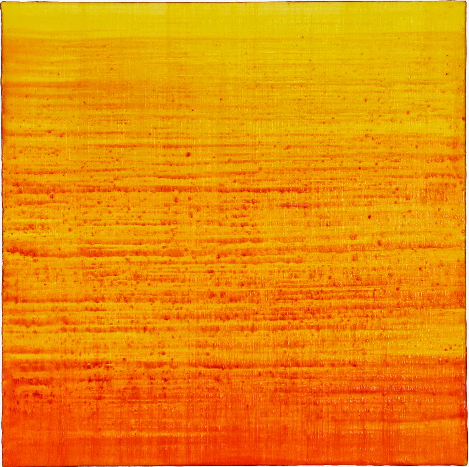
Melt, 2014, watercolor and mixed media on panel, 18 x 18 inches

About the Work

In these new abstract paintings in watercolor on wood panels, a classical European technique used by Vermeer and Rembrandt, called underpainting, is reconfigured for a contemporary dialogue of Nature versus Culture. Materials become metaphors. As sunlight illuminates stained glass, an underpainting is a layer of dark and light –thick and thin tones -over which transparent color is applied for a luminous effect.


Here, the underpainting is made visible: it erupts through and interacts with the painted surface in order to form a literal and metaphoric response or disconnect between Nature and Culture. The underpainting represents Nature–raw, thick and unruly–while the vertical stripes equal culture.

The materials are metaphors and used in a non-traditional way: the underpainting or support for the paintings is built-up in successive layers of acrylic mediums mixed with volatile additives such as stone, soda ash, and glass. Humidity and chemistry, different mediums and mixtures react in unforeseen ways that are not always understood until dried. Each layer requires different drying times and results in organic shapes similar to geological formations.

No conscious attempt to replicate the surface look of Nature is made. However, a result of living year-round on Cape Cod and teaching in Boston resonates with the way Nature and Culture interact, are visualized and separate. The material process of making these paintings engages chance operations –a certain letting-go of ego or individual choice -and the resulting textures become metaphors for climatic and geological change or, are transformative change itself.


Verdant/Oxidized, 2014, watercolor and mixed media on panel, 12 x 12 inches


Erode/Corrode, 2014, watercolor and mixed media on panel, 12 x 12 inches


Aqueous/Viscous, 2014, watercolor and mixed media on panel, 12 x 12 inches


Thaw,  2014, watercolor and mixed media on panel, 20 x 16 inches


Reflecting on Cape Cod

Since the 1950s, I’ve observed many changes on Cape Cod: Introduced to Cape Cod, as a child through the marine science community in Woods Hole where my friend’s father was a ‘summer scientist’ at Marine Biological Lab (MBL), I saw the ocean differently. The drive from Boston on Route 3 was one lane with sand drifts that stalled cars until scientists discovered that pines planted in sand firmed the soil then beach grass grew, this reduced sand drifts and stalled cars.

My first impression of Cape Cod was the marine science community where I met luminaries of the arts and sciences alongside abundance of heat, sand, water and pines. The importance of marine science to the world can’t be overstated as we face climate change. Since my 2001 move to the Cape, I’ve attended science lectures in Woods Hole at MBL, WHOI and the National Academy of Science. In 2010, I curated an off-Cape exhibit with a science seminar: Extinct! Endangered Species and Habitats will have companion exhibit in 2016.

Early 70s, in Provincetown with artist friends from Boston, the Cape was a summer retreat given a historical perspective by my maternal grandparents:
. In the 1920s, newly wed, my grandparents ran guest inn, Eight Bells, in Provincetown, home to Provincetown Players (1915-1929) and, playwright Eugene O’Neil alongside notable writers and artists. Provincetown Players “wintered” in New York City.

Over the next decades, in every season, I visited friends in Falmouth and Provincetown.

In 2001, I bought a home and built a studio on upper Cape Cod, a direct result of Boston’s gentrification. Life on Cape continued as if I was in Boston: I work in my studio and exhibit; write a column about the arts published in Europe; curate exhibits and, teach painting in Boston at the School of the Museum of Fine Arts/Tufts University.

Changes on Cape Cod over six decades include: 
. Changing coastlines
. Climate change fostered a new ecosystem and economy:  More snowfall. Humid summers defined as tropical in meteorological terms
. New climates altered migratory patterns of non-native birds and an excess seals both drawn by Cape’s warmer air and waters that also brought sharks 
. The decline of Cod and the Cape's fishing industry
. More tourists, more year-round residents and more culture

Climate change as much as my move from the city to a seaside community has changed my focus and my artwork.
Inspiration? Cape Cod’s science community, climate change and nature, in that order:
. Light on water inspired over a decade of writing and fascination with glass as art. Water’s fluidity and geological layers inspired watercolors
. Climate change on Cape Cod –extreme winter storms, tropical bird songs, extreme textures of moss and ice on trees, flooded coastlines -all these natural events and raw textures have inspired metaphors (and, realities) in my new paintings and photography
. Concurrent with abstract paintings exhibited at Cape Cod Museum of Art, I continue to make artwork reflective of contemporary social issues and phenomena in many media

Of Cape’s many attributes, I’ve always associated Cape Cod with marine science in Woods Hole, culture in Provincetown and nature in New England’s four seasons.


Stardust, 2014, watercolor and mixed Media on panel, 12 x 12 inches


Cenote, 2014, watercolor and mixed media on panel, 12 x 12 inches


Crystalized, 2014, watercolor and mixed media on panel, 12 x 12 inches

www.smfa.edu/erica-adams 

Monday, February 23, 2015

Emily Berger

"I love the landscape of the Cape; it comes in and goes out in my work like the water, a swelling and repetitive movement with variations, as in music."

Untitled, 2013, oil on wood panel, 22 x 18 inches


About the work

My work is abstract, but some of my inspiration derives from the light, color and urban landscape I see framed through my studio window and from what I remember and see of nature. I love the landscape of the Cape; it comes in and goes out in my work like the water, a swelling and repetitive movement with variations, as in music. The sag in the paintings, evoking waves, gravity and the body, creates another rhythm between the curved and the straight, although my lines are never really straight. I want evidence of the hand, and sometimes the quaver of a tremor, too. I often prime the wood before painting in a way that even more texture will emerge as I brush across the surface. I am not sure exactly what will come up in the under layers. I react to whatever happens there, including the color and pattern of the wood. An element of chance is crucial. The work combines elements of the rational and irrational, the gestural and the geometric. The repetitive and deliberate gesture in these paintings is intuitive, but carefully considered – conscious and unconscious.  When I am painting I try to get to that place where they are the same, no split. The conversation between me and the painting can slow down or speed up, stay simple or get more complicated. It can be quiet and meditative or get a little looser and veer off in another direction. I don’t want to resolve every painting the same way. I am looking for moments when something new comes up, like shape or a certain light. I take my time about where to make the marks, and how to make them, and I often go back and back – adding and subtracting with brushes and rags.  I’m working things out non-verbally, mentally and physically, making marks in this abstract language.  I hope the viewer can give me the time to be there with me as I do. 


Untitled, 2013, oil on wood panel, 26 x 22 inches


Untitled, 2013, oil on wood panel, 22 x 18 inches


Reflecting on Cape Cod

My family moved to the Boston area from the South when I was 5 years old. My parents had grown up in the Bronx, city kids, and moved to Chicago after the War where I was born in the 50s. After a couple of years in Chattanooga we moved to Newton, Mass., and they discovered the Cape. For them I think it was a dream, a place they could not have imagined for themselves growing up as they did. The Cape became our destination of choice every year, particularly Wellfleet. There were the bookstores, the library, concerts in the church and square dancing on the pier as well as the peacefulness and beauty of the dunes, ponds and beaches of the National Seashore. For me the Cape is the place I most love and long for. I soak up its beauty both modest and magnificent and carry it home to New YTork City, a private treasure. My work is influenced mysteriously, and directly - the water, the sky, the shore, the striations and horizon, the shifting light, reflections and color, all are in the work.


Untitled, 2013, oil on wood panel, 26 x 22 inches


Untitled, 2013, oil on wood panel. 24 x 20 inches


Untitled, 2014, oil on wood panel, 24 x 20 inches


Untitled, 2013, oil on wood panel, 22 x 20 inches

www.emilyberger.net

Thursday, February 19, 2015

Joanne Freeman

"My quest for fictional abstract purity is derailed by the human elements of inaccuracy, humor and random thoughts."


Sweet Spot, 2013, oil on shaped canvas, 30 x 33 inches


About the Work

I have lived and worked as a painter in New York City for over thirty years. My early paintings were influenced by art, symbols and signage found on the streets of New York. That early visual language emerged into a reductive formal language with roots in modernist aesthetics and ideology.

My current abstract oil paintings combine gesture and geometry. The scale and proportions relating directly to my body proportions and my own arms reach. As the scale of the paintings increases the basic qualities of color, line and shape became amplified. The physical force of the painting now relates to both the personal and surrounding architectural space.

The consistent lines in my painting are made with a process similar to commercial silk-screening. I cut and mask out areas with tape before applying successive layers of oil paint. This controlled approach to mark making contrasts and accentuates, the painterly effects of the canvas and the doodle like character of the lines. The stylistic combination of the commercial, and the hand made, recalls the teachings of the Bauhaus and the merging of art and design. My quest for fictional abstract purity is derailed by the human elements of inaccuracy, humor and random thoughts.


White (c), 2012, oil on canvas, 18 x 18 inches


 Half Moon, 2014, oil on canvas, 30 inches diameter


Reflecting on Cape Cod

I started spending summers on the Cape with my family when I was around five years old. We rented the same cottage in a large group of cottages every summer in West Yarmouth. I grew up over those summers with many of the same families returning year after year. My family later bought a house in West Yarmouth, and my daughter has grown up swimming and playing on the very same streets and beaches that I first experienced as a child.

I now live and work as an artist in New York City, but I still spend summers on Cape Cod and still think of returning to the Cape as "going home". I partially credit those idyllic childhood summers with my choice of becoming an artist. The flow of days created a sense of freedom and discovery that I later sought to recreate in my studio practice. The state of mind that comes from unscheduled time and play.


White (a), 2012, oil on canvas, 18 x 18 inches


White (d), 2012, oil on canvas, 18 x 18 inches


Sunday, February 15, 2015

Sarah Hinckley

"I approach painting intuitively, constantly adjusting as clarity comes."


And the Wind Whispers, 2012, oil on canvas, 35 x 24 inches
(c) Sarah Hinckley


About the Work

My work is inspired from growing up on Cape Cod surrounded by color fields of water, marsh, beach and sky, and Rothko, Agnes Martin, 60’s formalist color field painting and the method of Monet’s late paintings. 

Recent inspirations come from walks taken behind my parents house in Barnstable, on Chapin Beach in Dennis at low tide, riding the subway in New York, seeing the color someone’s jacket, while out in nature or falling asleep at night thinking about all the projects I am working on in my studio.

I approach painting intuitively, constantly adjusting as clarity comes; most of the work takes a few months to complete and some remains in conversation for a year or more.  Certain elements can remain unresolved for extended periods of time and then the process slows, reminding me of the virtue of patience.  I incorporate two approaches while working; one, editing; the second, writing out ideas and inspiration in a painting journal.  The journal is important because I am not always able to work on an idea right away because oil paint needs to dry or other life commitments arise.  I develop the color fields by putting down marks and editing them in or out depending on how I see it.  This process of editing allows me the opportunity to continually be searching, whether it a new direction or idea or a new color relationship.

Mapping out ideas and inspirations from my world, bringing it all into the studio challenges me to remain present, aware, and open to all the possibilities that are happening with materials before me.


Just Holding Back, 2014, oil on canvas, 30 x 25 inches
(c) Sarah Hinckley


Reflecting on Cape Cod

I was born and raised on Cape Cod.  My family has a long history.  My Dad's family immigrated first to Plymouth/Boston during the early stages of the great migration. They quickly decided to move south and settled in Barnstable village in the early 1640's.   My Mom's family started spending summers in Harwich Port when she was a child in the early 1930's.
 
While growing up on the Cape the seasons seemed long.  We spent as much time outside as the weather and light allowed.  My parents were very enthusiastic about picnics at the beach, cookouts in backyards, clamming on Sandy Neck, raking leaves and just playing.  Once we were old enough to ride a bike we roamed the neighborhood... that neighborhood consisted of a few houses but mostly fields, marsh, beach and this expansive sky hanging over us.   When inside my Mom was big on "quiet time spent in our rooms alone" it was there that I found myself drawing and painting... I realized later in life that is where I first discovered the visual impact of my surroundings and the need to let it out.

As I got older I couldn't wait to get off of the Cape and that presented an intense struggle within.  I went out in the world only to come back.  I tried this many time until I found a path in art school first California and Boston and later graduate school in New York. 

I am always brought back to my first encounters with painting when in my studio now.  I paint intuitively with deep influence from the landscape of my childhood.  No matter how hard I try to separate myself from Cape Cod some sense of it always appears.


Something Got a Hold on Me, 2013, oil on canvas, 30 x 25 inches
(c) Sarah Hinckley

Friday, February 13, 2015

Joanne Mattera

"I refer to my painting as lush minimalism."


Installation grid of 18 paintings from the Silk Road series, each encaustic on panel, 12 x 12 inches


About the Work

My painting is materially succulent and compositionally reductive. I refer to it only partly tongue-in-cheek as “lush minimalism.” Each painting in the ongoing Silk Road series is a small color field achieved by layers of translucent wax paint applied at right angles, which I may allow to form ridges and slubs in the final layers. The series, which I began in 2005, was inspired by the  shimmery quality of iridescent silk, hence the title, but quickly evolved into a more broadly ranging exploration of color and light—a sweet irony in that I’m using the most material of paints to express the most transcendent of phenomena. The artist and essayist Chris Ashley has described my work this way: “While the light is a thing that draws us in, it’s the way this light is held in the wax, and the way we look below the surface and into the depth of this light-filled wax, that slows down our looking just a beat to a more present presence, one that is slow enough for us to see light passing.”


Silk Road 243, 2015


Silk Road 241, 2015
Paintings courtesy of Schoolhouse Gallery, Provincetown


Reflecting on Cape Cod

I’ve been a visitor to the Cape for as long as I can remember, first as a child in the summer with my family, and then as an adult when it has beckoned year round. When I came out as a lesbian at 21, I made a beeline for Provincetown. Oh, the joy to see others like me! What sweet freedom to walk arm and arm with a girlfriend, to flirt, to go swimming, to be me without judgment or fear of being outed. The memories from that time are almost dreamlike, not just because they are wrapped in the lightness of youth, but because the great burden of secrecy one carried then was left behind, if only for a week or two. 

After 9/11, when from my rooftop on West 21st Street I saw the Twin Towers fall, it was solace to round the bend of 6A and see the Pilgrim Monument rising up where it had always been and to realign with the primordial rhythms of ebb and flow. 

Even as things have changed, largely now for the better, painting has been a constant in my life—40 years and counting. Five years ago I brought the International Encaustic Conference, which I founded and direct, to Provincetown, in co-production with Cherie Mittenthal and Truro Center for the Arts at Castle Hill. The event attracts 250 painters, printmakers and sculptors from as far away as New Zealand, Scandinavia and South America, and they are as smitten with that almost 360-degree meeting of sky and ocean, and the incredible clear light, as I have been all these years. I am back over the bridge regularly, a drive I never tire of making. And you'd think I'd be jaded by now, but I still experience a little heart flutter when I round the bend on 6A and see the Monument and the tip of the Cape stretching out around that magnificent Bay.


Silk Road 221, 2014


Silk Road 222, 2014


Silk Road 244, 2015
Courtesy of Schoolhouse Gallery, Provincetown


Silk Road 188, 2014
Courtesy of Arden Gallery, Boston


Tuesday, February 10, 2015

Mira Schor

"My work has strong conceptual and political elements set within a deep commitment to formal and painterly values." 

The Dreams of All of Us, 2012, ink and oil on gesso on linen, 24 x 28 inches


About the Work

The works I have selected I have two names for, as a group that is, The Dreams of All of Us series, after the title and the words depicted in the first painting of the series, and the Occupy Series.

The Dreams of All of Us series is really about Occupy Wall Street. I painted these four paintings in early 2012, a few months after Occupy Wall Street in Zuccotti Park in downtown Manhattan. I wanted to address the inspiration that it sparked. The protesters sleeping in the park somehow represented this incredible generosity, almost a sacrifice for the rest of us. It parallels sleep with resistance: in New York and in other cities at the time, presumably you could stand in the park, but if you had a tent or if you started to fall sleep, even on a bench, you were breaking the law (all this still holds true I’m sure).

The first painting began with the figure sleeping under a series of dream bubbles or cartouches that spell out the words "the dreams” “of”  “all” “of us." I was trying to figure out how to express in my newest work the effect of Occupy Wall Street. This gets at some of the basic problematics of political art: Do you represent? Do you illustrate? Do you perform? I already was painting these sleeping dreamers, and then I was touched by a comment made by the student of a friend, which she posted on Facebook. The student (whose name I don't know, but I'm grateful for the eloquence) wrote, "In abstraction, one might think of Occupy Wall Street as a 'Sleep-In.' What fascinates me about this particular conceptualization is that it implies using the body's faculties for repose and rest(oration) in an artistic form of activism.… The use of the shutdown of the body to attempt a shutdown of the system is not only a startling symbol (metaphor), but also a deployment of the one thing that capitalism has not yet fully infiltrated: our sleep. It metonymizes sleep with resistance."

This was such a beautiful idea. I have a lot of trouble sleeping, but love to and need to sleep; one of my favorite scenes in the movie Orlando was the long sleep from which Orlando awakens as a woman. As he sleeps on, doctors are summoned, they examine him, and finally, with great and deliberate pomp, they declare, "The Lord Orlando is sleeping." I often think of that line with longing for such an epic and transformative sleep. Meanwhile the tents and all the apparatus of sleeping at OWS was the unglamorous (and courageous) nitty-gritty basis of what they were doing and maybe what drives authorities craziest. They are (they were) lying outside at night, vulnerable, for us, and collectively they were dreaming for us.


Negative of the Positive, 2012, ink and oil on gesso on linen, 24 x 28 inches

The Darkest Part of the Night, 2012, oil on linen, 24 x 28 inches


The next paintings in the series, Negative of the Positive and The Darkest Part of the Night, take us through a dark night, as darkness falls on a cold sidewalk, and then the darkness that presses in and obscures even the dreamer. I do end on a hopeful note though: in the last painting the figure is awake. It’s bright yellow and titled This is the Future.

My work has strong conceptual and political elements set within a deep commitment to formal and painterly values. Over the years I have drawn upon figuration, landscape, and language, with a narrative undercurrent, and always with a great interest in form and texture. I see my work overall as one work, in which individual pieces function like individual film frames or the stills from a movie, and in a way this series recapitulates this as it depicts the same scene through a passage of time.

Language as image has been a principal subject of my work since 1970s. In the 70s the language was personal and autobiographical in nature. In the work from the ’90s to 2006, the language was appropriated, mostly from the news, or was related to art making itself: words like trace, sign, painting, drawing, even the word writing. After my mother died in 2006, I felt I had to start back at a kind of zero of my identity as an artist; I started with basically just a blob of black ink and that developed into the empty thought balloon. It turned out to be a great space in which to paint paint, to place paint where you expect to find language. Some of those thought balloons looked a lot like heads so I put eyeglasses on them, and then about a year later gave them a very basic body, with stick figure legs so they could start walking around and encountering the world. I'm a politically minded person, always drawn to oppositional ideologies and polemics. Interiority and exteriority occur sometimes in the same work, or works in a series shift from one frame to the other.
  
I call the figure an “avatar of self.” I’m not sure if that is a distancing gesture. It may seem that way but actually I try to express as directly as possible where I am at a particular moment: in space, literally, in my garden in the summer reading, or in my studio, and where I am in my sensations, emotions, and thoughts. The diagrammatic and cartoon aspects of the work come from the speed necessary to keep the flow between everything that I do in my work—paint, write, teach, read, draw, think—as connected and speedy as possible. In works from the early ’70s that were more specifically figurative, I represented my figure and the space where I was with more detail and fullness though not in an academic manner, more in the representational vein of Florine Stettheimer for instance or Rajput painting. Now the cartoon and diagram modes allow for the co-existence of figure, landscape, and language without any need for the niceties of representational rendering.

These comments are culled from a number of interviews with me from a couple of years ago that flesh out more information about my work:
The Thing Itself: Mira Schor + Bradley Rubenstein, part 2

This is the Future, 2012, ink and oil on gesso on linen, 24 x 28 inches


Reflecting on Cape Cod

I first came to Provincetown with my parents when I was seven years old. My parents Ilya and Resia Schor had tried some of the other summer art colonies in the Northeast, Rockport and Woodstock, where they were friendly with Philip Guston and his family, but Provincetown proved to be the place. We had many friends who summered on the Cape, in Ptown, Truro and Wellfleet, including the families of Jack Tworkov and of Chaim Gross. As a child I immediately fell in love with the place, the landscape of the bay and the ocean, and I've spent most of my summers there since, especially after my mother bought a house in 1969, a few years after my father died. My mother Resia worked in a small space downstairs, I worked upstairs and my sister Naomi also worked upstairs writing at a desk with a view of the bay, a seat I now use when I write. Even though I'm not currently a landscape artist in any traditional sense, the landscape has influenced my work and the rhythm of being there in the summer is a big part of my life, which I hope to continue despite the economic unrealities of it at this point. The summer of 2013 I wrote a series of blog posts about that experience, Day by Day in the Studio. The first post is here.